Pinta: Adjustments Menu
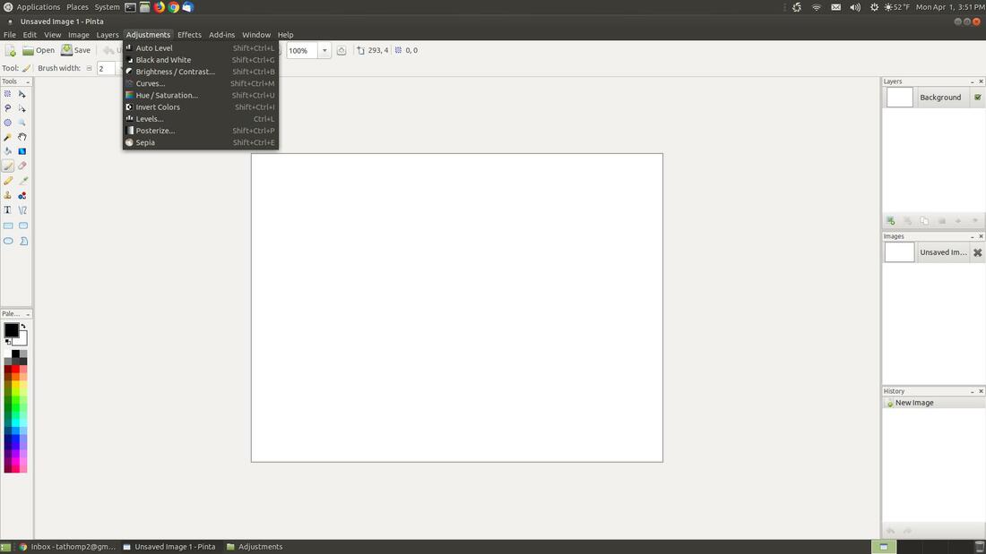
The Adjustments menu contain commands which modify the colorization of pixels in an image. Each of the default photo editing adjustments in the menu have associated keyboard shortcuts.
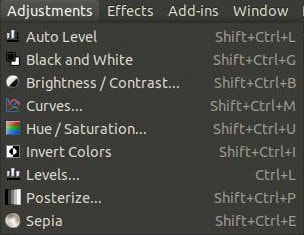
Ajustments can be applied to an entire image or to a certain section of an image.
Auto Level
Auto Level is used to equalize the colors in an image.
This command attempts to bring an image which are underexposed (too dark) or overexposed (too light) back within normal range. There are no configurable options, so it doesn't have a dialog box.
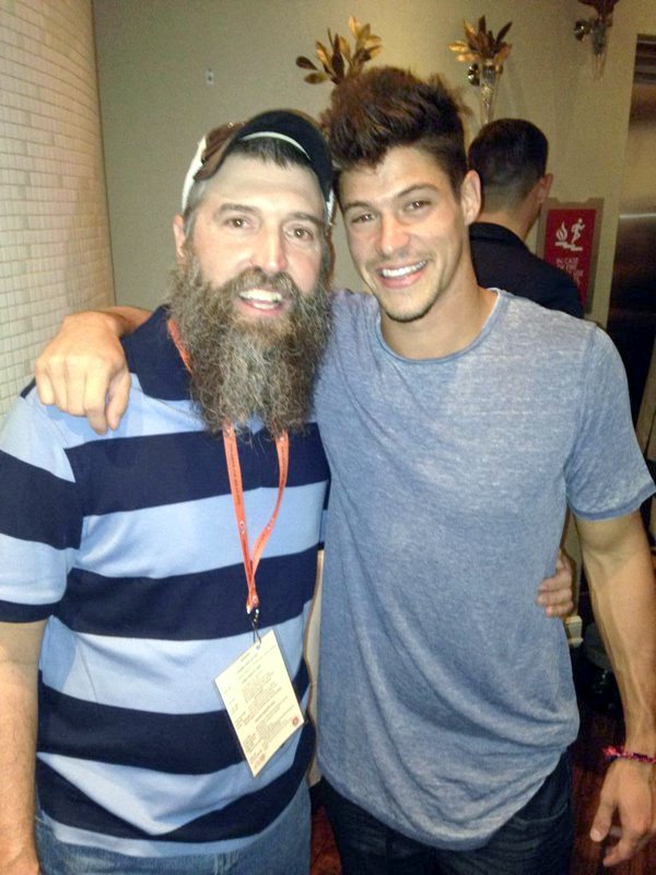
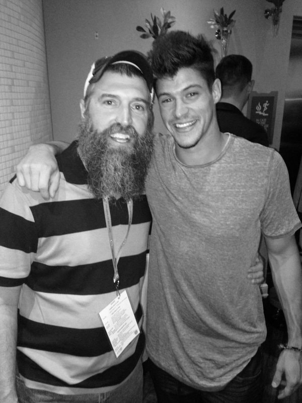
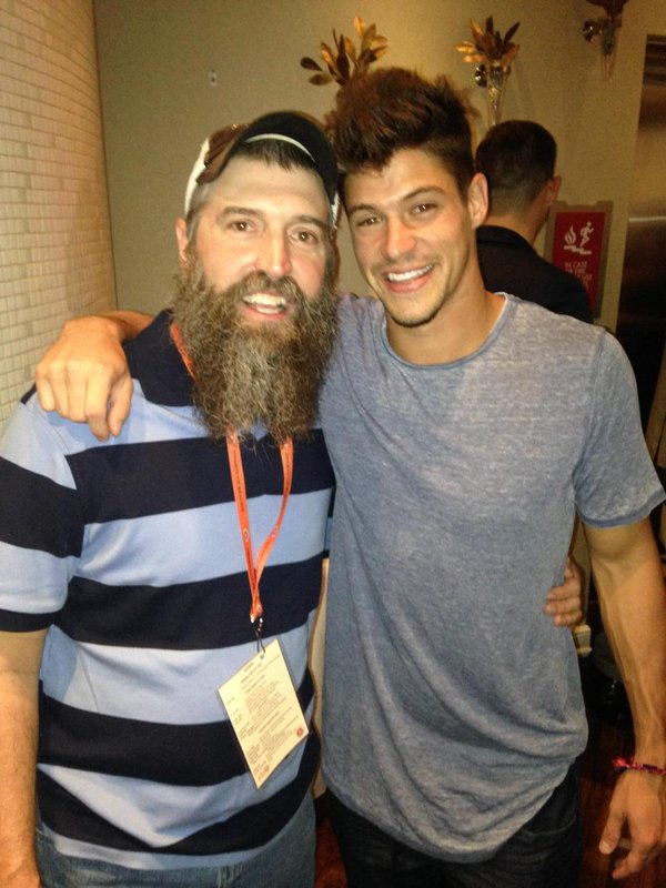
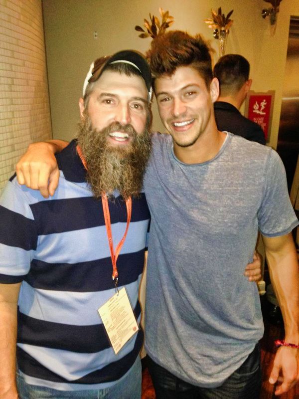
Below is my brother Donny Thompson and his friend Zach Rance. They both were houseguest from US Big Brother Season 16.
Auto Level is used to equalize the colors in an image.
This command attempts to bring an image which are underexposed (too dark) or overexposed (too light) back within normal range. There are no configurable options, so it doesn't have a dialog box.
Below is my brother Donny Thompson and his friend Zach Rance. They both were houseguest from US Big Brother Season 16.

|
|
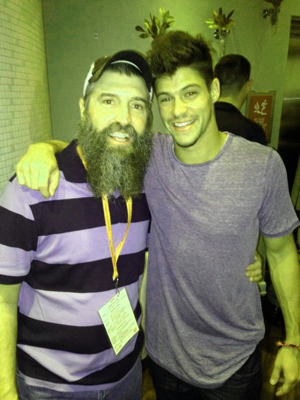
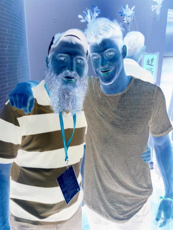
Before (left) and after applying Auto Level (right).
You can see the dark areas in the background were brightened up by using the Auto Level feature. You can use Auto Level feature in isolation or with a combination of other Adjustments. In the examples below, I will use an individual command in isolation to demonstrate how each Adjustment feature works.
Black and White
The Black and White adjustment removes the color in an image and renders the image in grayscale. The results of an image will appear in black, white, and shades of gray.
This adjustment has no configurable options, so it doesn't have a dialog box.
The Black and White adjustment removes the color in an image and renders the image in grayscale. The results of an image will appear in black, white, and shades of gray.
This adjustment has no configurable options, so it doesn't have a dialog box.

|
|
Before (left) and after using Black and White (right).
Brightness / Contrast
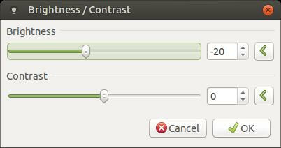
The Brightness / Contrast adjustment is used to make your image brighter or darker (Brightness), or to adjust the difference in luminance between color tones (Contrast).
Brightness
To increase the overall brightness of an image, move the Brightness slider to the right or increase the number next to the Brightness slider bar. To decrease the overall brightness of an image, move the Brightness slider to the left or decrease the number next to the Brightness slider bar.

|
|
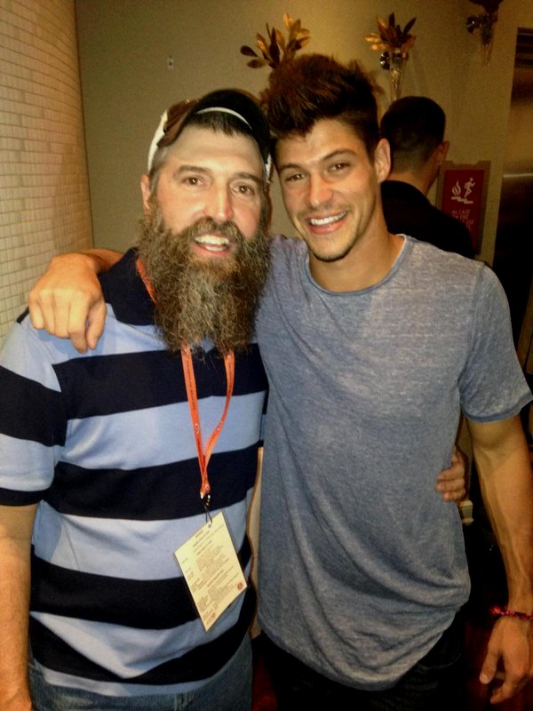
Before (left) and after using decreased Brightness (right).
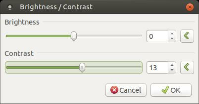
Contrast
Contrast will allow you to adjust the difference in luminance between color tones.
You can decrease the Contrast value by moving the Contrast slider to the left or decrease the number next to the slider bar. This will make your color tones more similar which will make the colors appear dull. You can increase the Contrast value by moving the Contrast slider to the right or increase the number next to the slider bar. This will make your colors appear more vivid.

|

|
Before (left) and after using increase Contrast (right).
Curves
The Curves adjustment is used to adjust the luminosity and/or RGB (Red, Green & Blue) color curves of an image.
The Curves adjustment is used to adjust the luminosity and/or RGB (Red, Green & Blue) color curves of an image.
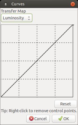
The Curves adjustment allows you to control the intensity of the shades inside an image. It allows you to enhance or dim specific ranges of intensities or color.
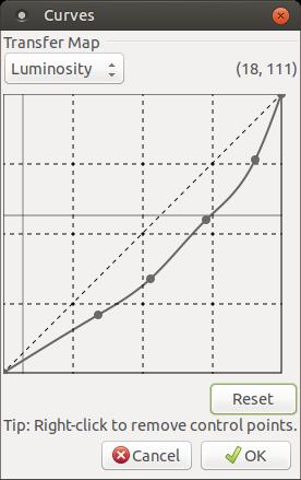
When the Curves dialog box first appears, it will display the the Luminosity Transfer Map as shown in the image above. In the Luminosity graph, the horizontal values are the intensity input and the vertical values are the intensity output. (Luminosity is the quality of something that gives off light or shines with reflected light.)
Moving or adjusting parts of the line or curve above the default position will cause the affected areas to brighten and moving or adjusting parts of the line or curve below the default position will cause the affected areas to to darken.
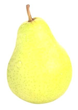
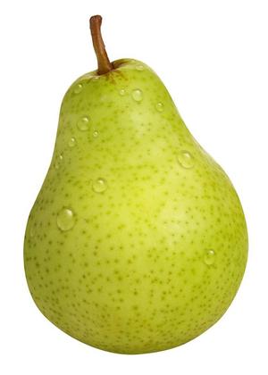
For the Curves adjustment examples, I will use a single object in my image. Below is the original image I will be using:
When the Curves dialog box first appears, it will display the the Luminosity Transfer Map as shown in the image above. In the Luminosity graph, the horizontal values are the intensity input and the vertical values are the intensity output. (Luminosity is the quality of something that gives off light or shines with reflected light.)
Moving or adjusting parts of the line or curve above the default position will cause the affected areas to brighten and moving or adjusting parts of the line or curve below the default position will cause the affected areas to to darken.
For the Curves adjustment examples, I will use a single object in my image. Below is the original image I will be using:

Original Image
Brightening with Curves
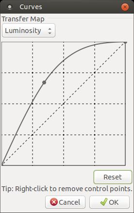
The left side of the of the line or curve (darker areas) has been dragged upwards. This has the effect of lightening the darker areas.

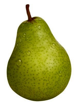
Original Image
|
Resulting image is brighter
|
Darkening with Curves
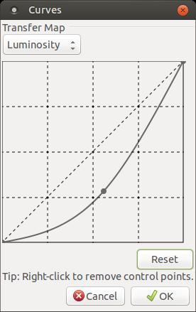
The right side of the line or curve (lighter areas) has been dragged downwards. The effect is to darken the lighter areas in the image.
Original Image
|
Resulting image is darker
|
The dot you see on the line or curve is called a control point. A control point is used to affect the line or curve. You can add a control point by clicking anywhere on the line or curve or an area where no control points exists. You can remove a control point from the line or curve by right-clicking on it.
Multichannel Adjustments
The Curves adjustments also let you perform actions against the Red, Green, and Blue color channels. You can switch to this mode by clicking the drop-down list next to Luminosity and change it to RGB.
The Curves adjustments also let you perform actions against the Red, Green, and Blue color channels. You can switch to this mode by clicking the drop-down list next to Luminosity and change it to RGB.
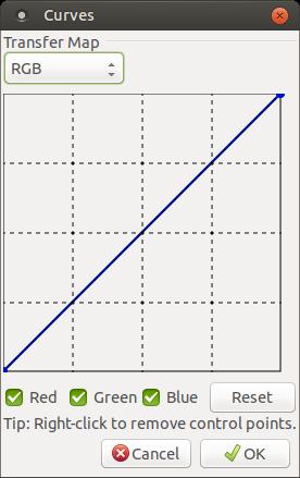
When you activate the RGB mode, you'll notice the colors Red, Green, and Blue have checks next to them. You can click on a check to remove it from the check-box. An individual color is referred to as a channel. When you make changes to a line or curve it will make changes to the color channel that has a check in its check-box. You have the ability to work on an individual channel or a pair of channels simultaneously.
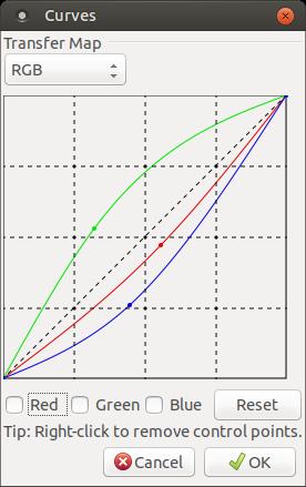
As you can see in the graph or image above, I increased or pulled the Green colored line upwards and decreased or pulled the Blue and Red lines down. Below is the results of the change.

Original Image
|
Results of RGB Change
|
Hue/ Saturation
The Hue/ Saturation adjustment is used to change the saturation or vividness of the colors in an image. This adustment also allow you to change the lightness of an image.
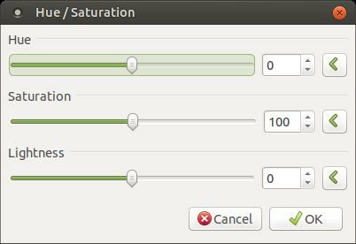
Hue
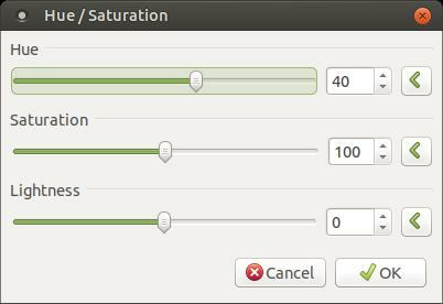
The Hue slider or control will rotate your colors used in the image.
The Hue slider or control will rotate your colors used in the image.
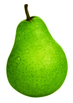
Original Image
|
Modified image showing Hue rotated to 40
|
Saturation
The Saturation slider or control makes color tones more or less vibrant.
The Saturation slider or control makes color tones more or less vibrant.
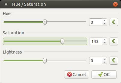
Increasing the Saturation number will make colors more vibrant and decreasing the number will make the colors look washed out. Moving the slider to the right increases the number and moving to the left decreases the number.

Original Image
|

Saturation increased to 143. The colors are more vibrant.
|
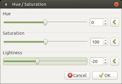
Lightness
The Lightness control is used to alter the exposure of an image. Increasing the Lightness value makes the image brighter and decreasing the Lightness value makes the image darker.
The Lightness control is used to alter the exposure of an image. Increasing the Lightness value makes the image brighter and decreasing the Lightness value makes the image darker.

Original Image
|
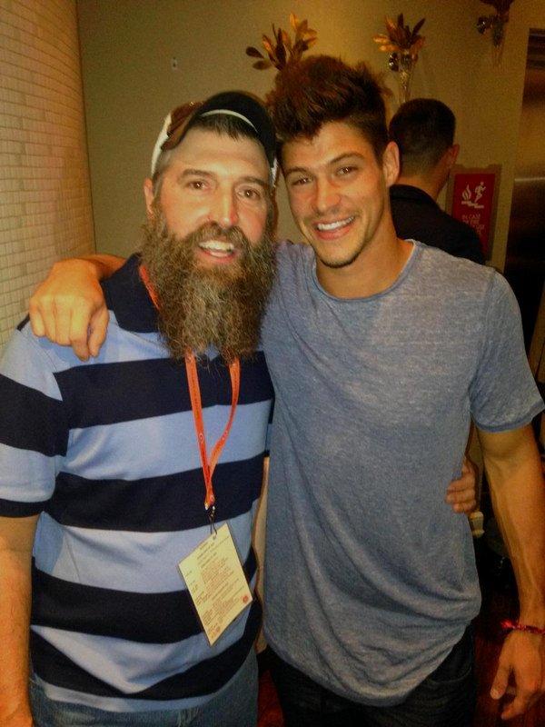
Image being Dimmed with a Lightness value of -20
|
Invert Colors
The Invert Colors adjustments will swap the colors in an image to the hue found on the opposite side of the color wheel. For example, white will become black and vice versa. Using this adjustment for a second time will restore the original colors.
The Invert Colors adjustment has no configurable options, so it doesn't have a dialog box.
The Invert Colors adjustment has no configurable options, so it doesn't have a dialog box.

Original Image
|
After Color Inversion (Similar to Photo Negative)
|
Levels
The Levels adjustment is used to change the color range of an image and to make gamma adjustments. It is one of the most complex commands in the Adjustments menu.
The Levels adjustment is used to change the color range of an image and to make gamma adjustments. It is one of the most complex commands in the Adjustments menu.
Level Adjustments will allow you to change where the brightest and darkest pixels in your image are.
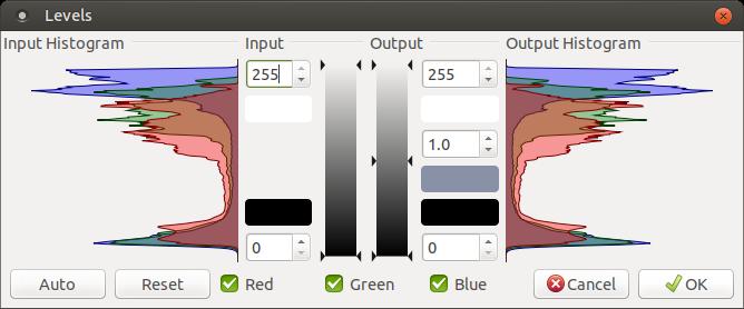
The Levels dialog box is made up of two halves, the left side "Input Histogram" (a.k.a. Input) represents the color range of the original image. The right side "Output Histogram" (a.k.a. Output) represents the image after the adjuestments have been made. A histogram allows you to visualize the distribution of data over a continuous interval or certain time period. The histograms you see in the image above is a chart of all the possible tonal values in an eight bit digital image.
Levels allows you to control the brightest tones, the darkest tones, as well as the midtones in a photograph. This will allow you to get just the right amount of contrast and brightness you want. From the darkest possible valves from the bottom of the chart, through a range of gray values, over to the brightest possible values at the top. The huge mounds represent the actual tones in the image. If you could seperate a mound, you would see it is made up of individual bars. The height of a bar represents the frequency of the corresponding tone in the photograph. Most of the tones from the graph above are near the brightest gray region. If these tones were in the center or gray area then it would lack contrast. There wouldn't be much difference between the brightest tones and the darkest tones. However, we can still adjust the contrast to make the image look better.
Below is the image that the chart above represents. It is a nice looking photograph; however, we can reduce some darkness and emphasize some of the colors and details in the image.

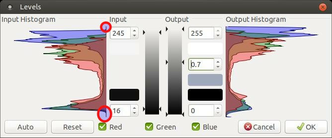
If you look at the Input Histogram, you'll notice it has a small area on each end that is flat or nothing. We can increase the contrast of the image by getting rid of that empty space. In the upper Input, we got rid of the blank space by reducing the Input from 255 to 245. In the lower Input, we got rid of the blank space by increasing the Input from 0 to 16. Then we increased the overall brightness of the image by changing the Center Output value from 1 to 0.7. Decreasing the Center number will raise the center slider on the verticle bar or Output. This will brighten your image.
Here's the result of those three small changes.

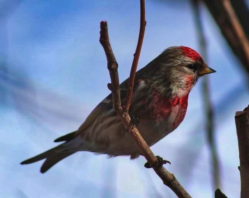
Below is a side-by-side comparison. When you first look at the two images below, you don't notice a difference in them. However, when you look more closely at the two images, you'll notice the bird on the right is not as dark and the colors appear brighter and contain more detail.
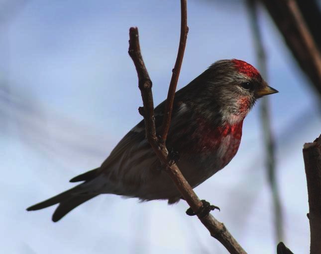
Before (Original Picture)
|
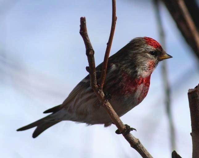
After
|
These slight changes were done from the small changes we made in the Level Adjustments.
On the examples above, all Adjustments have been performed on all the color channels (Red, Green, & Blue). By using the checkboxes next to R, G, B individual channels can be adjusted seperately or in pairs.
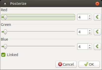
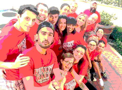
Posterize
This Adjustment tool is designed to reduce the number of color values in each pixel.
This Adjustment tool is designed to reduce the number of color values in each pixel.
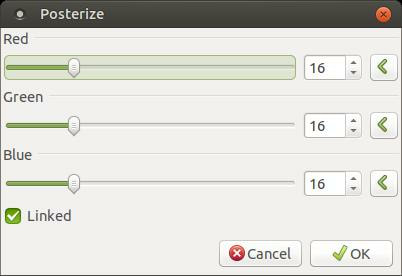
You can use the sliders or the input boxes with the double-arrows to set the number of levels (2-256) in each RBG channel. The RGB color channels can be manipulated independantely or they can be forced to use the same value if the Linked checkbox is checked.
Posterize allows you to make a more or less dramatic effect on your photo.
Below is an image I am going to use for my example. The Posterize dialog box above is the data for the photo below.
Posterize allows you to make a more or less dramatic effect on your photo.
Below is an image I am going to use for my example. The Posterize dialog box above is the data for the photo below.
I moved the sliders from 16 to 4.
Here's the results.

Below is a side-by-side comparison. Notice how changing from 16 to 4 had a dramitic effect on the image.

|
|
Sepia
The Sepia adjustment is used to produce a black-and-white image with a warm brown-ish tone. This will make your image look old.
The Sepia adjustment has no configurable options, so it doesn't have a dialog box.
The Sepia adjustment is used to produce a black-and-white image with a warm brown-ish tone. This will make your image look old.
The Sepia adjustment has no configurable options, so it doesn't have a dialog box.
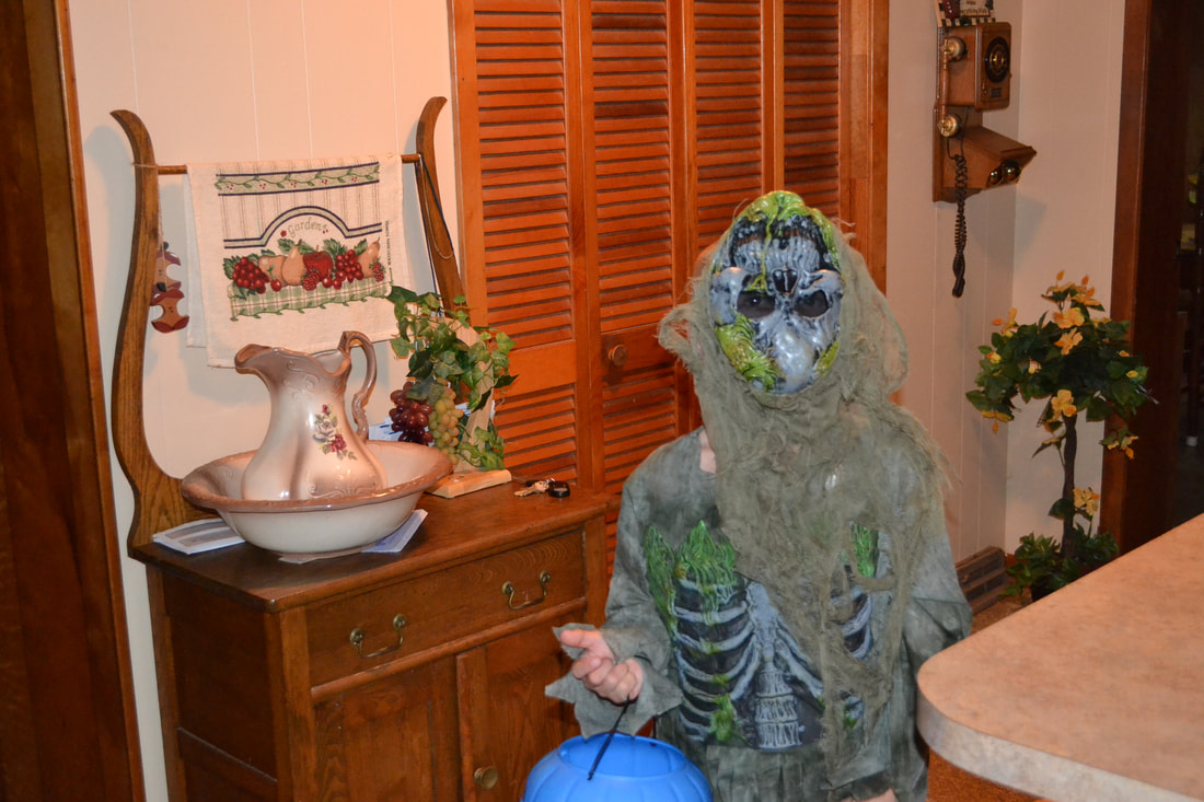
Before
|
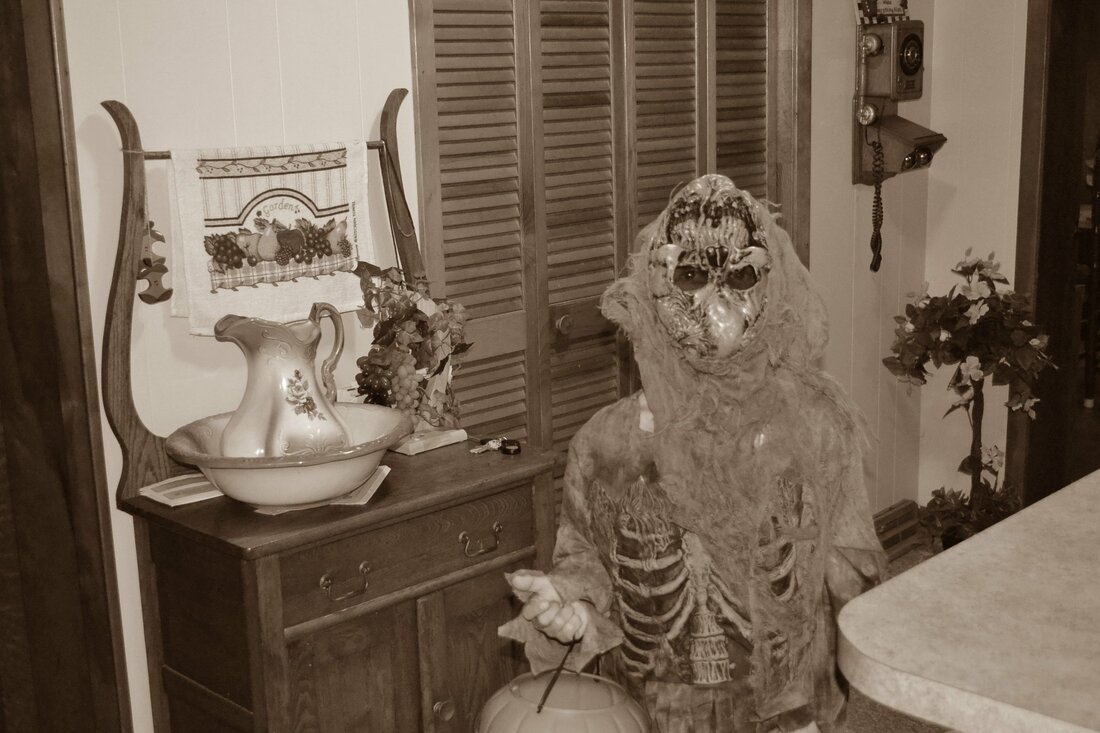
After applying the Sepia filter
|
The picture above is my nephew's son taken on Halloween of 2016.
Each example above was using an isolated command in the Adjustments menu to illustrate how the command works. Remember, you can use multiple commands in the Adjustments menu to alter your image. You can also mix several Ajustments commands with the commands in the Effccts menu.
Below are images that were modified or altered by using multiple Adjustments commands.
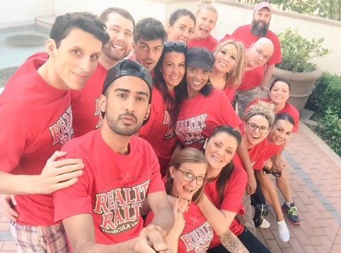
The picture below contains reality stars from Big Brother Canada and Big Brother US.
Below are images that were modified or altered by using multiple Adjustments commands.
The picture below contains reality stars from Big Brother Canada and Big Brother US.

Before
|

After
|
I found the picture of the bird online. I named the bird Sam.

Before
|
After
|
You've seen the picture below multiple times already, but you haven't seen it with multiple Adjustments.

Before
|
After
|
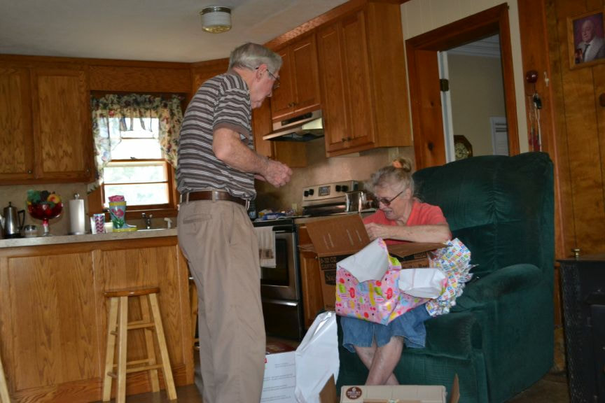
The image below is a photo of my parents. It was my mom's birthday.
Before
|
After
|
I hope this webpage has given you a better understanding of the tools found in the Adjustments menu. You can bookmark my site in case you ever need to use it as reference material.
Take care!
Take care!
Apr 7, 2019
